Logo Design for Slavonka
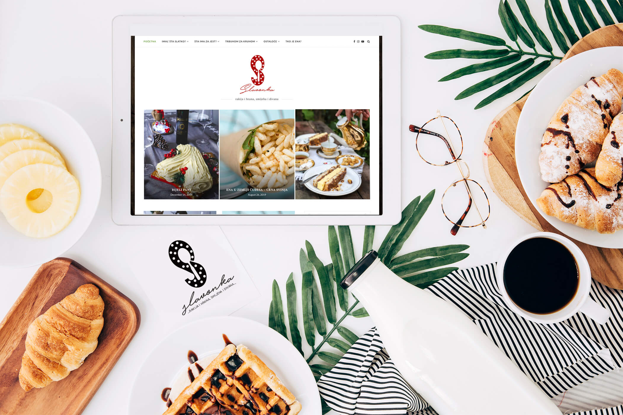
We found a solution for a new logo design of the super cool food blog Slavonka. It is a culinary blog that highlights the Slavonian tradition. Along with traditional dishes, the author often uses traditional Slavonian expressions and phrases common in this area. The blog is a blend of culinary skills, recipes, and beautiful photography.
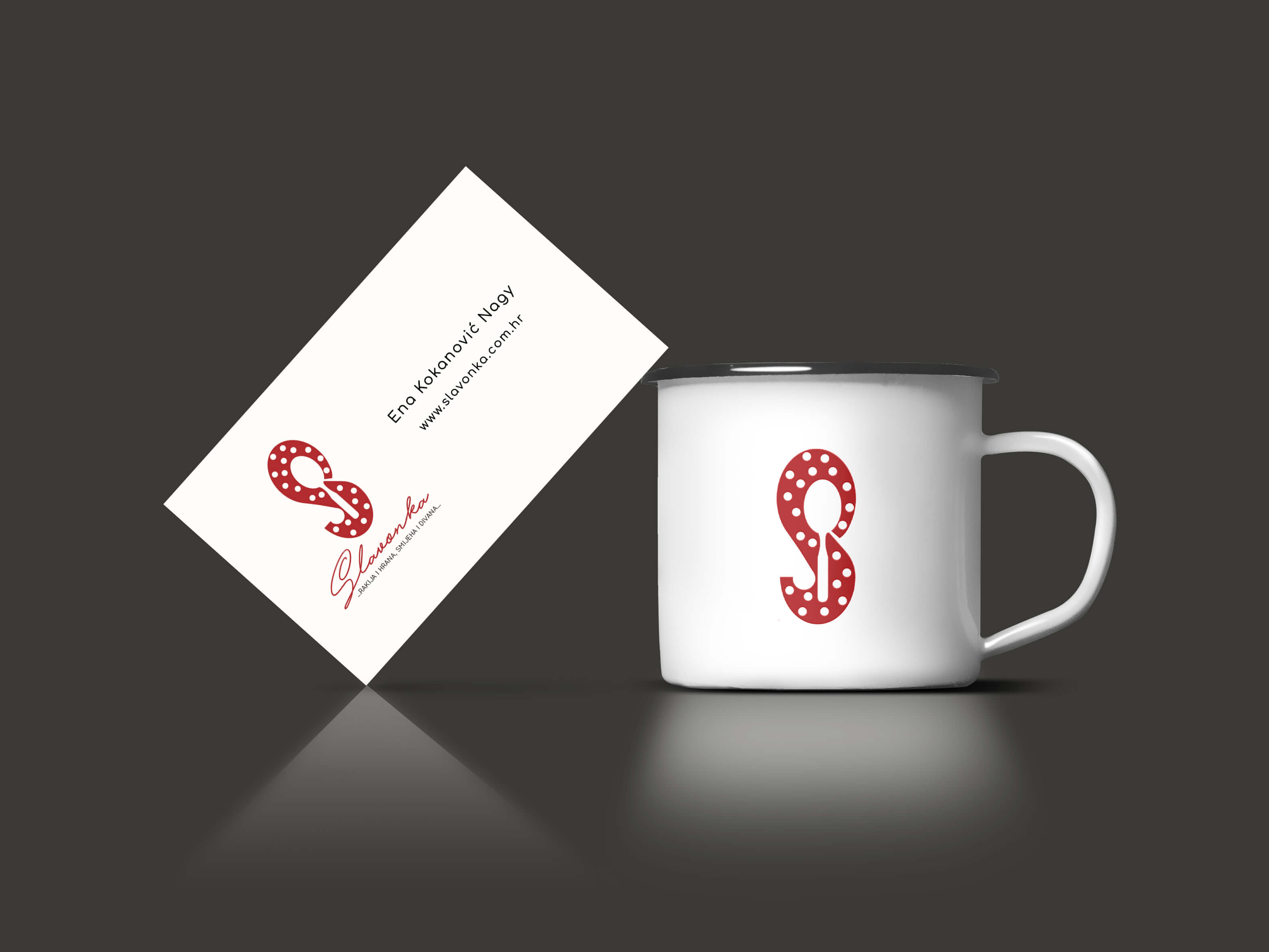
Behind this blog lies Ena, a charismatic woman, who had a specific wish for her new logo. A combination of her personality, laughter, love for traditional pots, cooking, and overall joy, gave us a lot to work with. This is how her slogan came about: “rakija and food, laughter and a friendly chat”. For the logo, we designed a stylized letter S whose negative space makes a spoon. We added white dots to the red letter S, which suggest the design of the cooking pot. Below that, we wrote Slavonka in a handwritten font.
Our client was satisfied with the solution, and we are glad that we contributed to this charming story.
Service
- Graphic Design
- Brending
Client
- Slavonka